
About the redesigned Endpoints News
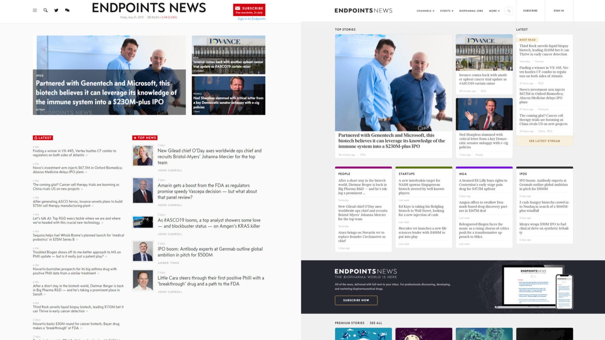
We’ve upgraded the Endpoints web experience for the first time since our launch three years ago. It was built from scratch internally with the reader in mind to be a cleaner and more useable platform. We have some specific goals in mind for the design, which I’ll describe below. And for those interested, I’d like to go into some depth behind the overall process and backend behind Endpoints News.
But first, a word of thanks to the CRO Biorasi for their exclusive sponsorship of the redesign. Endpoints’ chief revenue officer Mike Peck and I met the team a year ago at a conference, where we talked about clinical outsourcing and its place in drug development. Soon, we developed a brand campaign tied to the Endpoints brand refresh, and over the next two weeks you’ll see the results of that across the site.
I set out three major goals for the redesign. They were:
- Increase the conversion rate of web visitors into basic subscribers
- Increase the average number of stories read per visit
- 2x improvement on the design, fit, and finish
The first two can be objectively measured. And in the 48 hours since we soft launched the site, we’ve already seen improvements. Improving the rate at which new web visitors willingly and voluntarily subscribe to get the basic Endpoints email product is pure organic growth and remains our #1 marketing KPI. We crossed 50,000 recently. Three years ago, John Carroll and I kicked things off with around 1,000 personal contacts who were our Day One subscribers. And increasing the average number of stories read per visit is a critical measure of the discoverability of our news content. We were averaging around 1.2 stories per visitor. We expect to triple that number with this new design.
The last goal — a 2x improvement in the design — is a subjective one. And to do it justice requires a look that reaches back to well before the origins of Endpoints News. I’ll do that below for the readers who are interested.
For the rest, just know the design was created with you, the reader, in mind. Endpoints’ tech/design team is deeply committed to increasing the useability of the website. And that goes double for our premium subscribers (check out the new reader profile feature for a glimpse).
If you depend on Endpoints, but haven’t upgraded to a premium subscription — now is the time. Our Enterprise plan offer is a transparent, unlimited seat-license for companies for a flat $1,000/year regardless of headcount. And the Insider plan is $200/year for individuals. You can see all the benefits here.
Once again, thanks to Biorasi for their exclusive sponsorship of Endpoints News during the #BIO2019 convention. You’ll see their brand placements across the new platforms for the next two weeks, with a webinar launching later in the year. I encourage you to check out their new website as well.
We hope you enjoy the new Endpoints experience.
About the process and design
John Carroll described the earliest days of Endpoints News recently. It was a fully bootstrapped venture with four virtual employees.
Typography comparison. Top: old version (Equity) / Bottom: new (Ivar Text)
Click on the image to see the full-sized version
Longtime readers know that John and I were at a previous company. And when we founded Endpoints, we knew it was going to be a fully bootstrapped venture. We had a well-known editor. And with tools like WordPress, starting a media company today is so easy, anyone can do it.
But there was no budget for a designer. So the task fell between our CTO Igor Yavych and myself. Frankly, we’re no designers.
Comparison of the old Endponts News homepage with the June 2019 upgrade
Click on the image to see the full-sized version
Last year, thanks to the success of our paid subscription campaigns, we were able to start building out our team. We brought on board Valentin Manov as our creative director, and the new fit and finish you see today are his contributions.
It was vitally important to me that once we had a design budget, we would make “good design” an internal capability — not something we’d outsource. When designers have access to the online newsroom, they get to see what’s important to editors and that in turn shapes their reader-facing work. We did not want to go to an outside agency and ask for pitches on what they thought our news experience ought to be.
Back in March, I flew to Sofia, Bulgaria to meet up with Valentin and Igor and finalize the basic outlines of the design you see today. We named this release “Rakia,” which is the most popular brandy in the Balkans.
We’re eager to know what you think about the design.
PS: In order to embrace the newest technologies that are coming, we had to end support of some very old web browsers. Older versions of Internet Explorer are no longer supported: If you’re on a PC, Microsoft’s Edge browser is excellent. Igor recommends the Opera Browser. My recommendation? The latest version of Chrome will always do.